Capital One is a US bank headquartered in McLean, Virginia. Starting as a credit card company Capital One expanded to become a retail bank in 2005. Even though the company expanded, their logo remained virtually unchanged. This is a redesign proposal for the bank, done for the Logo Redo show on The Futur.
The current logo, initially introduced in 2008 brought a swoosh that felt dated and a bit generic. The varying type weights and the baseline shift in the logotype, readability issues in small scales called for a cleaner and simpler design.
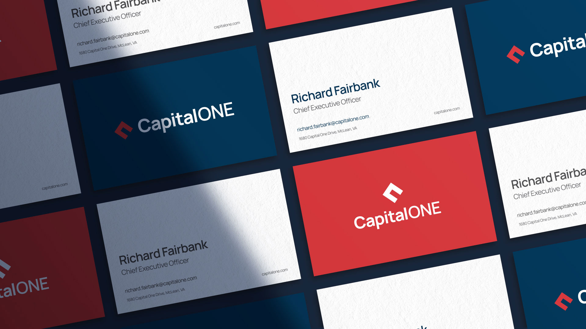
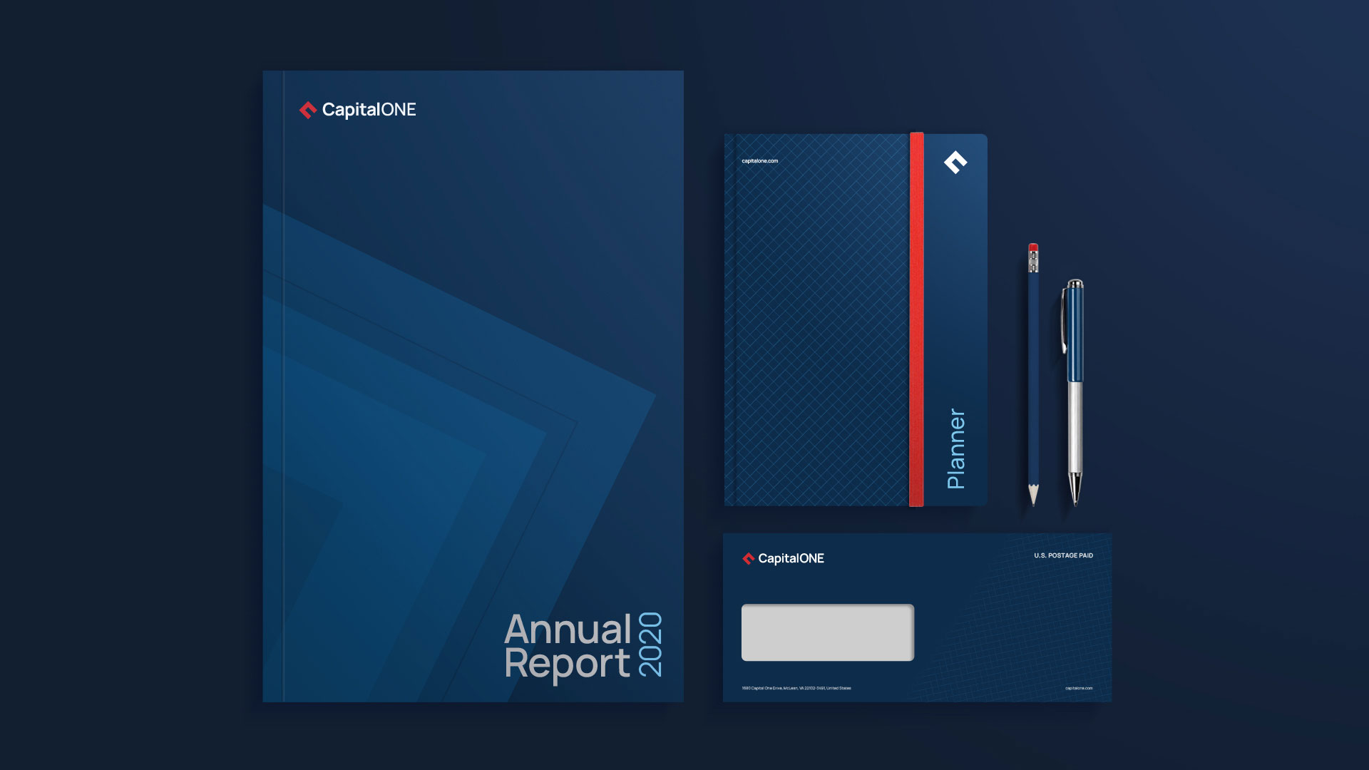
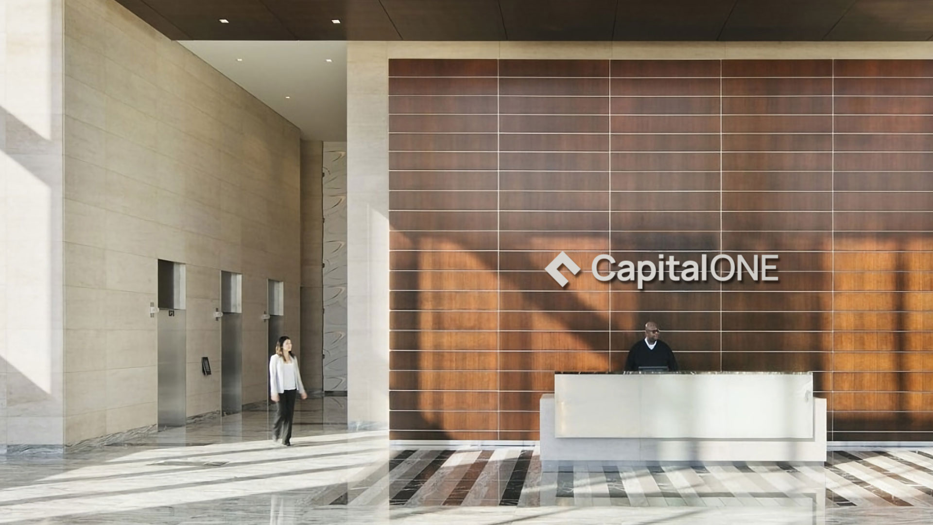
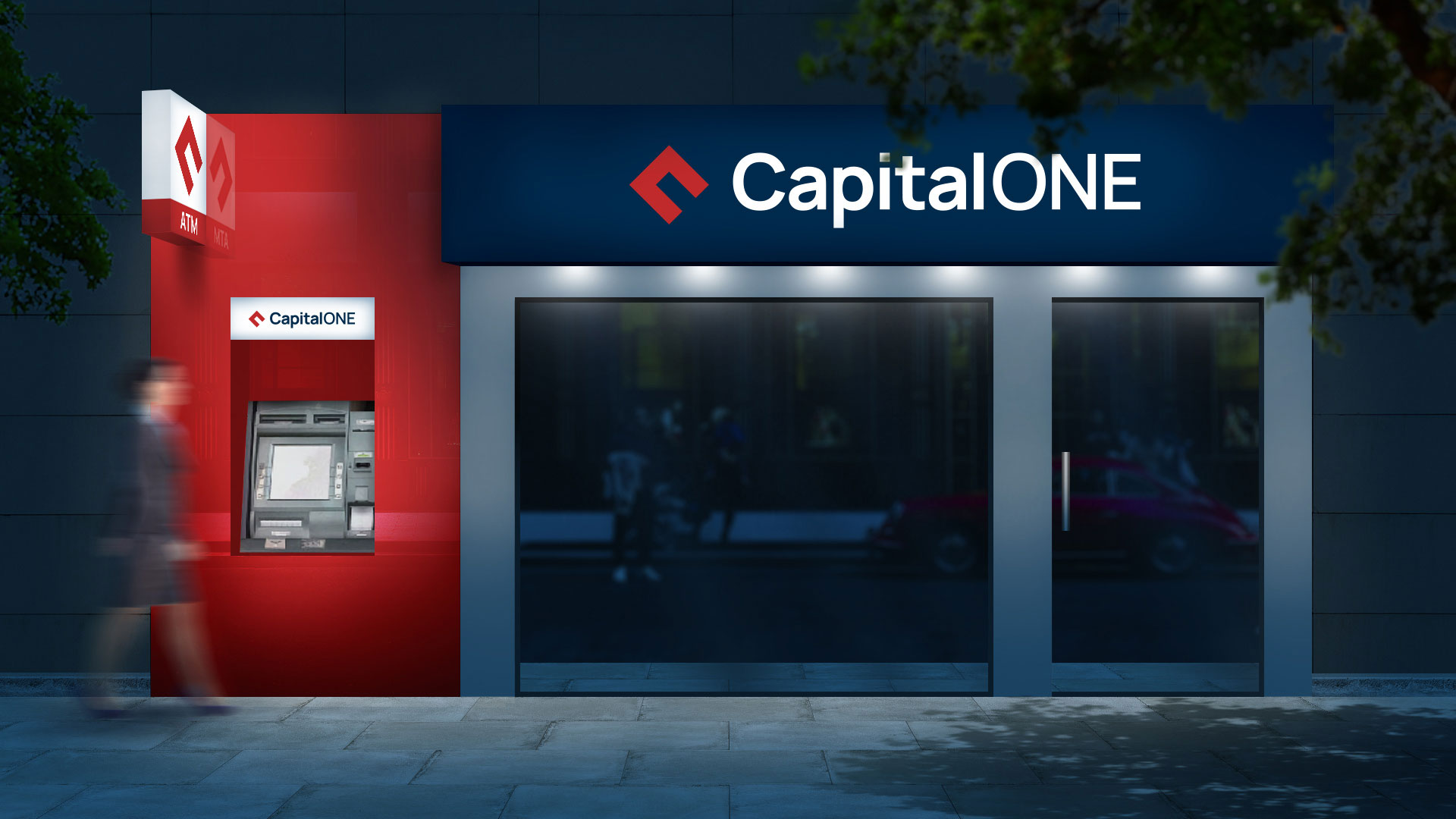
The new logo mark is a ‘C’ with a ‘1’ depicted in its negative space. The bold geometric form of the mark conveys stability and the 45° tilt a sense of dynamism and innovation.
Capital One redesign was selected to be featured in The Most Impressive Logo Redesigns by DesignRush.