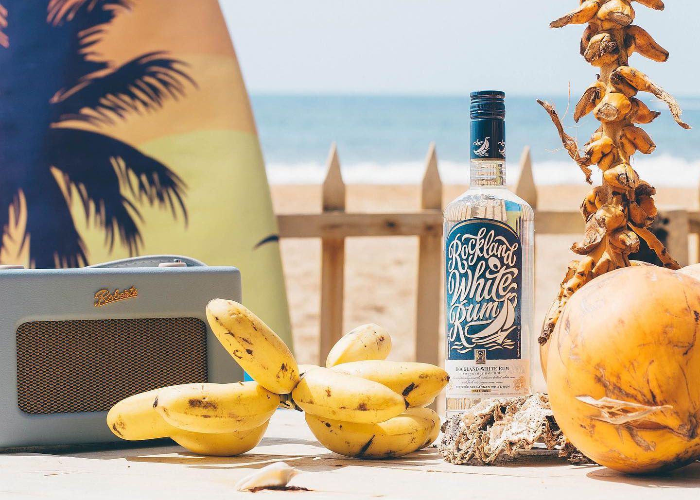
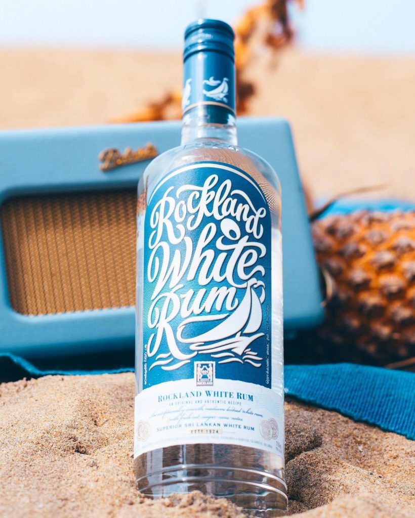
Rockland White Rum’s design has always been inspired by the sea, with a cool ocean blue paired with white lettering
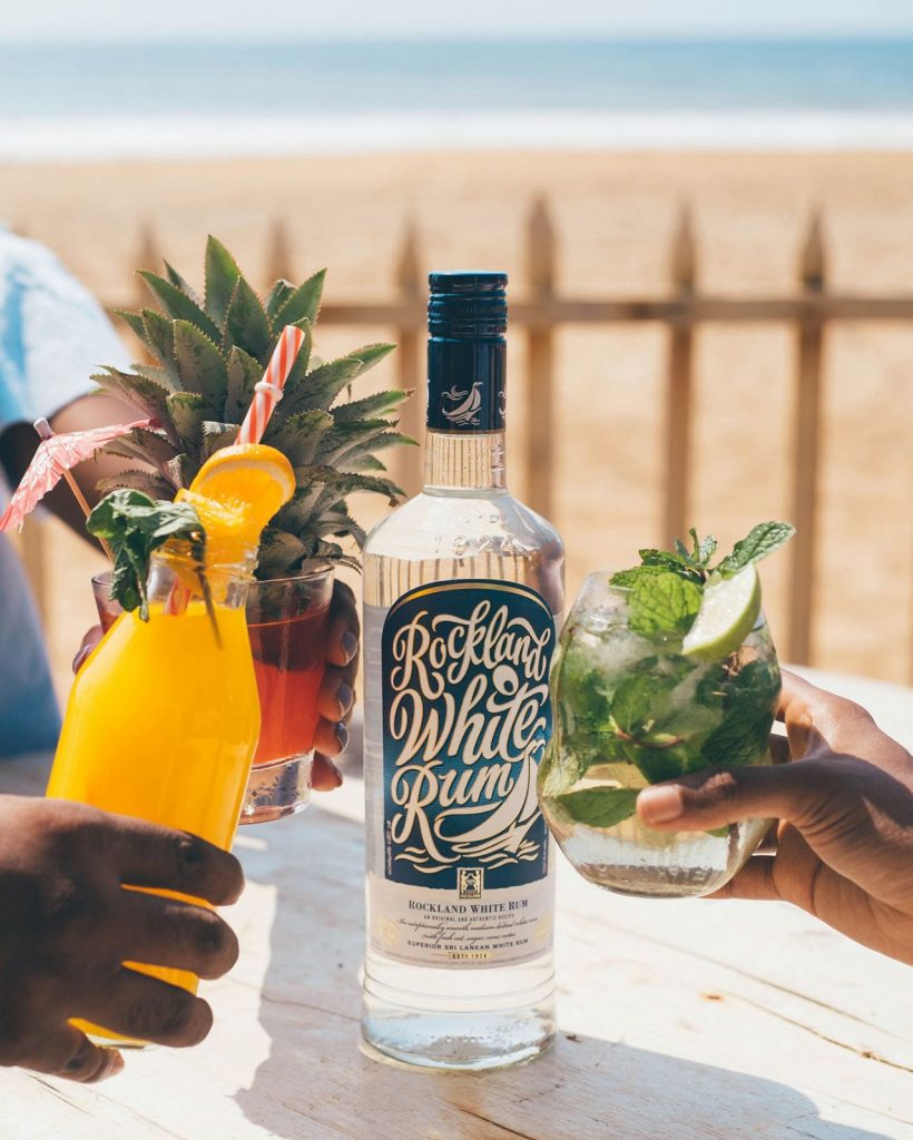
Rockland’s White Rum has a new look and I absolutely love it.
Rockland White Rum’s design has always been inspired by the sea, with a cool ocean blue paired with white lettering, giving a sense of relaxation and calm. The new design builds on this and pushes it further for a more refined look.
The lettering has been improved significantly with cleaner lines and a more organic composition. This has significantly improved the legibility of the label while retaining the original look. White Rum’s iconic ‘sailboat’ has been integrated into the lettering, to work as one visual block than a separate graphic element. The gold foil detailing and the subtle wave pattern is a welcome addition.
It was quite refreshing to see the attention to detail overall. With the fine print’s skillful combination of typefaces and the graphical embellishments; to the new bottle design with its stamped typographic detailing, they have created something on par with international design.
It’s great to see companies like Rockland raising the bar in terms of design. Hope to see more products undergoing redesigns and other companies following suite.